Fancy plots
2021, May 03
such as Sakey plot, circos plot, marginal plots and word clouds.
In [1]:
import json
import requests
import plotly.express as px
import difflib
import geopandas as gpd

import pandas as pd
import matplotlib.pyplot as plt
import seaborn as sns
import numpy as np
import matplotlib.colors as mcolors

import holoviews as hv
from chord import Chord
from wordcloud import WordCloud
Sakey Plot
In [2]:
df = pd.read_csv("datasets/sankey.csv")
df.head(2) # require long data
Out[2]:
| FROM | TO | VALUE | |
|---|---|---|---|
| 0 | Brazil | Portugal | 5 |
| 1 | Brazil | France | 1 |
In [3]:
# hv.extension('bokeh')
# df = pd.read_csv("datasets/sankey.csv")
# sakey = hv.Sankey(df, kdims=["FROM", "TO"], vdims=["VALUE"])

# sakey.opts(cmap='Spectral',
#            label_position='right',
#            edge_color='FROM',
#            edge_line_width=0.5,
#            edge_alpha= 0.8,
#            node_alpha=0.5,
#            node_width=10,
#            node_sort=True,

#            width=1100, height=500,
#            bgcolor="white",
#            margin=0, padding=0,
#            title="My Fancy Sankey Plot")
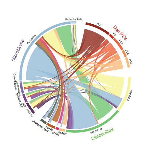
Circos Plot
In [4]:
circos = pd.read_excel("datasets/migration.xlsx", skiprows= 1)
circos = pd.read_excel("datasets/migration.xlsx", skiprows= 1)
circos.drop(columns = ['Unnamed: 0', "Unnamed: 17"], inplace=True)
circos.rename(columns = {'Unnamed: 1': 'Origin'}, inplace=True)
circos.set_index("Origin", inplace=True)
print(circos.shape) # square matrix!
circos.head(2)
(15, 15)
Out[4]:
| North America | Central America | South America | North Africa | Sub-Saharan Africa | Northern Europe | Western Europe | Southern Europe | Eastern Europe | Central Asia | Western Asia | South Asia | East Asia | South-East Asia | Oceania | |
|---|---|---|---|---|---|---|---|---|---|---|---|---|---|---|---|
| Origin | |||||||||||||||
| North America | 96102 | 208668 | 68240 | 4253 | 58827 | 248379 | 279267 | 551959 | 162959 | 85259 | 131288 | 158 | 39145 | 41758 | 52303 |
| Central America | 3233173 | 215008 | 36975 | 390 | 2414 | 42572 | 81356 | 190931 | 4962 | 3145 | 6236 | 14 | 1754 | 510 | 7541 |
In [5]:
# names=list(circos.columns)
# df = circos.values.tolist()

# circos = Chord(df, names,
#               font_size_large='10px',
#               wrap_labels=False,
#               margin=100,
#               width=800)

# # only way to display is save it and load after
# circos.to_html('circos.html')
Stacked barchart
In [6]:
colors= list(mcolors.TABLEAU_COLORS.values())
df = pd.read_excel("datasets/census.xlsx",)
df.drop(columns=["Unnamed: 23"], inplace=True)
df_bar = df.loc[:, df.mean() > 4000].transpose().reset_index()
df_bar = df.transpose().reset_index().loc[1:,:]
df_bar.columns = ['region'] + df.ANNI.values.tolist()
df_bar.region.iloc[1] = "Valle d'Aosta"
df_bar.region.iloc[4]='Trentino-Alto Adige'
df.head(2)
c:\users\dell\venv\jupyter\lib\site-packages\pandas\core\indexing.py:1637: SettingWithCopyWarning:
A value is trying to be set on a copy of a slice from a DataFrame

See the caveats in the documentation: https://pandas.pydata.org/pandas-docs/stable/user_guide/indexing.html#returning-a-view-versus-a-copy
  self._setitem_single_block(indexer, value, name)
Out[6]:
| ANNI | Piemonte | Valle d'Aosta-Vallée d'Aoste | Liguria | Lombardia | Trentino-Alto Adige/Südtirol | Bolzano-Bozen | Trento | Veneto | Friuli-Venezia Giulia | ... | Marche | Lazio | Abruzzo | Molise | Campania | Puglia | Basilicata | Calabria | Sicilia | Sardegna | |
|---|---|---|---|---|---|---|---|---|---|---|---|---|---|---|---|---|---|---|---|---|---|
| 0 | 1951 | 3518.00 | 94.000 | 1567.000 | 6566.000 | 729.000 | 334.000 | 395.000 | 3918.000 | 1226.000 | ... | 1364.000 | 3341.000 | 1277.000 | 407.000 | 4346.000 | 3220.000 | 628.000 | 2044.000 | 4487.000 | 1276.000 |
| 1 | 1961 | 3914.25 | 100.959 | 1735.349 | 7406.152 | 785.967 | 373.863 | 412.104 | 3846.562 | 1204.298 | ... | 1347.489 | 3958.957 | 1206.266 | 358.052 | 4760.759 | 3421.217 | 644.297 | 2045.047 | 4721.001 | 1419.362 |
2 rows × 23 columns
In [7]:
m=df_bar.transpose()
m.columns = m.iloc[0,:]
m = m.iloc[1:]
sum_over_all_years=m.sum().reset_index(name='tot')
sum_over_all_years.sort_values(by='tot',inplace=True)
sum_over_all_years.head(2)
Out[7]:
| region | tot | |
|---|---|---|
| 1 | Valle d'Aosta | 778.313 |
| 15 | Molise | 2378.313 |
In [8]:
fig, axes = plt.subplots(3,1,figsize= (20,60))
sns.set_style("white")

#lineplot over 2000
for region in df.columns.values[1:]:
    if df[region].mean() > 2000: # decide to work only if the the mean of the region is over 2000!
        sns.lineplot(ax=axes[0], data=df, x = 'ANNI', y= region, label=region)

title = "LinePlot of the most highest important regions"
ylabel = "Value"
xlabel= "Year"
style_title= dict(size=20, weight='bold', style='italic')
style_labels = dict(size=15, style='italic')
axes[0].set_title(title +"\n",   fontdict=style_title)
axes[0].set_ylabel("Census Value")
axes[0].set_xlabel("Years")
for tick in axes[0].get_xticklabels():
    tick.set_rotation(45)
axes[0].legend(loc='upper left', ncol=4,
           fontsize=20, shadow=True,
           facecolor= '#d4ebf2',
           framealpha=0.8, borderpad=0.45)
axes[0].set_ylim(0,13000)


# stacked area chart with palette
palette= "tab10"
sns.barplot(ax=axes[1], data=df_bar, x='region',
            y = df_bar[1951]+df_bar[1961]+df_bar[1971] + df_bar[1981] + df_bar[1991] + df_bar[2001] + df_bar[2011], color=colors[0],label='up-to 2011')
sns.barplot(ax=axes[1], data=df_bar, x='region',
            y = df_bar[1951]+df_bar[1961]+df_bar[1971] + df_bar[1981] + df_bar[1991] + df_bar[2001], color=colors[1],label='up-to 2001')
sns.barplot(ax=axes[1], data=df_bar, x='region',
            y = df_bar[1951]+df_bar[1961]+df_bar[1971] + df_bar[1981] + df_bar[1991], color=colors[2],label='up-to 1991')
sns.barplot(ax=axes[1], data=df_bar, x='region',
            y = df_bar[1951]+df_bar[1961]+df_bar[1971] + df_bar[1981], color=colors[3],label='up-to 1981')
sns.barplot(ax=axes[1], data=df_bar, x='region',
            y = df_bar[1951]+df_bar[1961]+df_bar[1971], color=colors[4],label='up-to 1971')
sns.barplot(ax=axes[1], data=df_bar, x='region',
            y = df_bar[1951]+df_bar[1961], color=colors[5],label='up-to 1961')
sns.barplot(ax=axes[1], data=df_bar, x='region',
            y = 1951,color=colors[7], label='up-to 1951')

title = "Stackbarchart related to the years"
ylabel = "Value from 1951 to 2011"
xlabel= "region"
style_title= dict(size=20, weight='bold', style='italic')
style_labels = dict(size=15, style='italic')
axes[1].set_title(title +"\n",   fontdict=style_title)
axes[1].set_ylabel("Census Value")
axes[1].set_xlabel("Years")
for tick in axes[1].get_xticklabels():
    tick.set_rotation(70)

axes[1].legend(loc='best', ncol=4,
           fontsize=20, shadow=True,
           facecolor= '#d4ebf2',
           framealpha=0.8, borderpad=0.45)

# last cumulatived and sorted
sns.barplot(ax=axes[2], data= sum_over_all_years, x='region', y='tot', palette='viridis')
title = "Cumulative and sorted stack bar chart"
ylabel = "Value from 1951 to 2011"
xlabel= "region"
style_title= dict(size=20, weight='bold', style='italic')
style_labels = dict(size=15, style='italic')
axes[2].set_title(title +"\n",   fontdict=style_title)
axes[2].set_ylabel("Census Value")
axes[2].set_xlabel("Years")
for tick in axes[2].get_xticklabels():
    tick.set_rotation(90)


# txt="Each stack represents a ten years count"
# axes[1].text(4.5, 60000, txt, wrap=True, horizontalalignment='center',
#              fontdict=(dict(size=25,style='italic', color='tab:blue')))

plt.show()

Marginal Plot
In [9]:
iris = pd.read_csv("datasets/iris.csv")
iris.head(2)
Out[9]:
| sepal length | sepal width | petal length | petal width | class | |
|---|---|---|---|---|---|
| 0 | 5.1 | 3.5 | 1.4 | 0.2 | Iris-setosa |
| 1 | 4.9 | 3.0 | 1.4 | 0.2 | Iris-setosa |
In [10]:
sns.set_style("whitegrid")

g1 = sns.jointplot(data=iris,
              x = "sepal length",
              y="sepal width",
              ratio =5,
              hue='class',
              legend=False,
              height=14,
              dropna=True,
              joint_kws=  {"alpha":0.8,"s":200,  # <- !
                           'style': iris['class'],
                           "markers" : ['o','s','d']},
              marginal_kws= dict(alpha=0.3))

g1.ax_joint.text(x=4.7,y=5.9,s='Iris Setosa', fontdict=(dict(size=20, color='blue')))
g1.ax_joint.text(x=5.7,y=5.9,s='Iris Versicolor', fontdict=(dict(size=20, color='orange')))
g1.ax_joint.text(x=7,y=5.9,s='Iris Virginica', fontdict=(dict(size=20, color='green')))

plt.show()

Line Plot
In [11]:
df = pd.read_csv("datasets/economist_data.csv")
df.head(2)
Out[11]:
| Country | HDI.Rank | HDI | CPI | Region | |
|---|---|---|---|---|---|
| 0 | Afghanistan | 172 | 0.398 | 1.5 | Asia Pacific |
| 1 | Albania | 70 | 0.739 | 3.1 | East EU Cemt Asia |
In [12]:
def text_scatter_xy(data, _x, _y, _s, space_x =0.3 , space_y=0.2, fontdict=None):
    for idx in range(len(data)):
        x = data[_x].iloc[idx]
        y = data[_y].iloc[idx]
        s = str(data[_s].iloc[idx])

        plt.text(x= x + space_x,
                 y= y + space_y,
                 s= s,
                 horizontalalignment='left',
                 fontdict = fontdict)
In [13]:
fig = plt.figure(figsize=(15,10))
sns.set_style("whitegrid")


g1 = sns.scatterplot(data=df, x='CPI', y='HDI', hue='Region', s=350,
                marker="$\circ$", edgecolor="face", linewidth=0.1)

sns.regplot(data=df,
            x='CPI',
            y='HDI',
            order=3,
            ci=0,
            scatter_kws=dict(alpha=0.0),
            line_kws= dict(color='red',label='r^3'),
             )

ticks_y = [i for i in np.arange(0.2,1.001,.1)]
label_y = [f"${str(round(i,1))}$" for i in np.arange(0.2,1.001,.1)]

ticks_x = [i for i in range(1,11)]
label_x = [f"${str(round(i,1))}$" for i in np.arange(1,11)]

plt.xticks(ticks= ticks_x, label=label_x, rotation=0)
plt.yticks(ticks= ticks_y, labels=label_y, rotation=0)

ylabel = "HDI"
xlabel= "CPI"

plt.ylabel(ylabel)
plt.xlabel(xlabel)

plt.hlines(y =np.arange(0,1,.1) ,
           xmin= 0, xmax=10,
           color='black')

plt.legend(loc='upper left', ncol=3,
           fontsize=20, shadow=True,
           facecolor= 'white',
           framealpha=0.8, borderpad=0.45,
           bbox_to_anchor=(0.10, 1.2))

plt.title("Corruption and Human development"+ "\n"*9)
plt.ylim(0.2,1)

annotation_dict= dict(size=15)
text_scatter_xy(df[::5], _x="CPI", _y="HDI", _s="Country", space_x=0.1, space_y=0.01,fontdict=annotation_dict)

plt.show()

Word Cloud
In [14]:
with open('datasets/license.txt', 'r') as f:
    text= (f.read())
In [15]:
fig = plt.figure(figsize=(10,10))


wordcloud = WordCloud(margin=0,
                      background_color ='white',
                      stopwords=None,
                      colormap='icefire',
                      collocation_threshold=300)

word_clouded = wordcloud.generate(text)


plt.imshow(word_clouded)
plt.margins(x=0, y=0)
plt.axis("off")
plt.title('Word Cloud\n\n',fontdict=dict(size=20, style='italic'))
plt.show()
